
The apple effect for overlay
Here you can see an Apple effect in action:

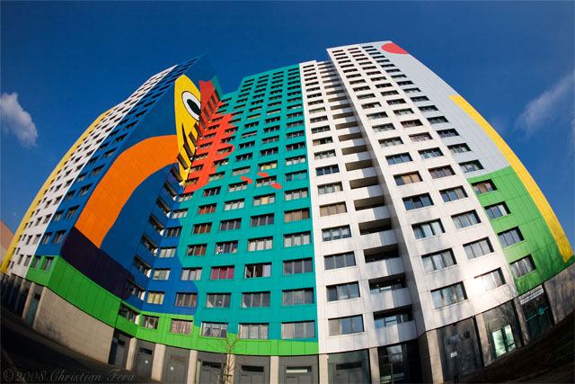
Berlin Gustavohouse
The Gustavo House in Storkower Strasse. It was built in 1978 and reconstructed in 1998 by the Spanish artist Gustavo.
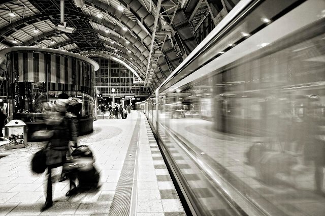
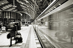
Berlin Alexanderplatz Station
Berlin Alexanderplatz is a railway station in the Berlin city centre and is one of the city's most important interchange points for local public transport.
Apple effect performs overlaying in a visually appealing manner by growing a background image from 0 to the desired size. This differs from "regular" overlaying solutions that do overlaying with static DIVs. The downside is that you are tied to the dimensions of the image. You can change the width but the height scales accordingly so that the aspect ratio remains constant.
HTML setup
The HTML setup is identical to the minimal setup for overlay. There are trigger elements and their corresponding overlay elements.
<!-- trigger elements -->
<img src="photos/gustavohouse.jpg" rel="#photo1"/>
<img src="photos/alexanderplatz-station.jpg" rel="#photo2"/>

<!-- overlay for the first trigger. id matches the rel- attribute -->
<div class="overlay black" id="photo1">
  <img src="photos/gustavohouse-medium.jpg" />

  <div class="details">
    <h2>Berlin Gustavohouse</h2>
    <p>
      The Gustavo House in Storkower Strasse. It was built in 1978
      and reconstructed in 1998 by the Spanish artist Gustavo.
    </p>
  </div>
</div>

<!-- overlay for the second trigger -->
<div class="overlay" id="photo2">
  ...
</div>
CSS coding
Some important things about the CSS coding of this effect:
- This effect requires that your overlay element uses a background image whose width is grown from zero to the desired size. The background image is defined for the overlay element using the backgroundImage CSS property.
- The close button is automatically generated by the overlay tool with the CSS class name close which you can use to style it. You can alter the class name from the configuration.
- The zIndex parameter is given in the overlay configuration and not in the CSS in contrast to the default effect. This parameter is specified for the growing image and the close button and the overlay contents are automatically given a value one greater so they will appear above the background image.
- You can use absolute positioning of the elements inside the overlay and those elements are positioned relative to the overlay element. This is because the overlay is also absolutely positioned. This is how CSS works.
We are using the overlay-apple.css stylesheet which looks like this:
/* the overlayed element */
.apple_overlay {

    /* initially overlay is hidden */
    display:none;

    /* growing background image */
    background-image:url(/media/img/overlay/white.png);

    /*
      width after the growing animation finishes
      height is automatically calculated
      */
    width:640px;

    /* some padding to layout nested elements nicely  */
    padding:35px;

    /* a little styling */
    font-size:11px;
}

/* default close button positioned on upper right corner */
.apple_overlay .close {
    background-image:url(/media/img/overlay/close.png);
    position:absolute; right:5px; top:5px;
    cursor:pointer;
    height:35px;
    width:35px;
}
You can use any browser-renderable background image with overlay. However, using PNG images allows you to have neat drop shadows in your overlays, since PNG supports alpha transparency, while GIF and JPG images do not. You can use the same background image at different sizes without experiencing significant quality degradation.
IE6 issues
IE6 does not support alpha-transparency for the overlays so we have used a different background for that browser:
<!--[if lt IE 7]>
<style>
  div.apple_overlay {
    background-image:url(/media/img/overlay/overlay_IE6.gif);
    color:#fff;
  }

  /* default close button positioned on upper right corner */
  div.apple_overlay div.close {
    background-image:url(/media/img/overlay/overlay_close_IE6.gif);
  }
</style>
<![endif]-->
Black "skin"
You can easily change the look of the overlay simply by changing the background image. In our example above we used black and white backgrounds. For the black overlay we have the class name "black" and its configuration is here:
/* black version of the overlay. simply uses a different background image */
div.apple_overlay.black {
background-image:url(/media/img/overlay/transparent.png);
color:#fff;
}
JavaScript coding
Here is the overlay configuration. We specify our "apple" effect with the effect configuration variable.
$("#apple img[rel]").overlay({effect: 'apple'});
Note: this effect is not included in the standard jQuery Tools distribution. You must download a custom combination that includes this effect.


